Whitelabel payment product · stablecoin fintech
A stablecoin payment product that tells the truth about money
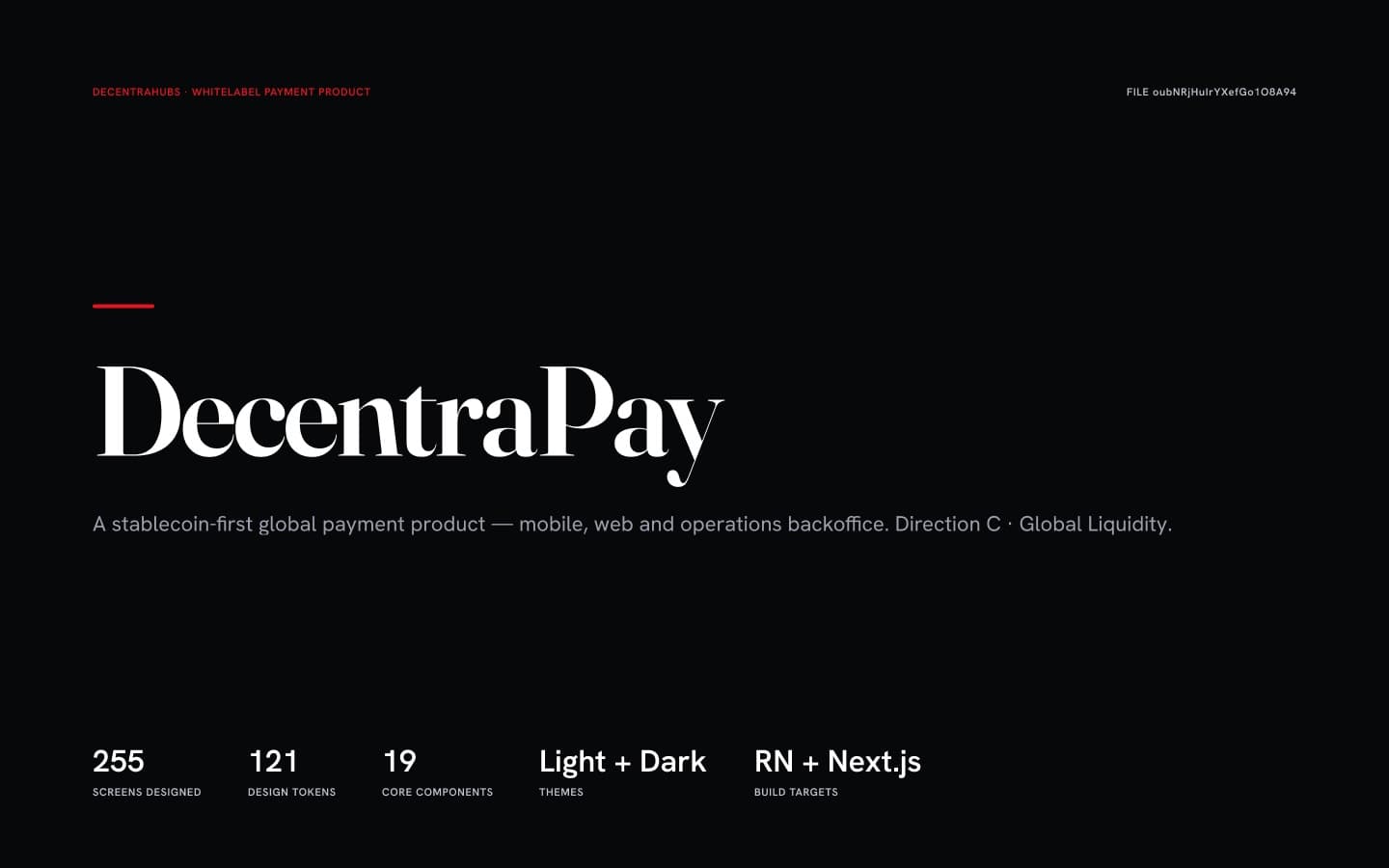
DecentraHubs' whitelabel, stablecoin-first payment product: a consumer app, a customer web app, a merchant console and the operations backoffice behind them — 255 screens on one token system, light and dark, held to a written money-honesty canon and audited by adversarial review.
Backdrop — the actual working file
- Role
- Product Designer · Product Manager — end-to-end
- Client
- DecentraHubs · own venture (whitelabel)
- Period
- 2026
- Platforms
- iOS · Android (React Native) · Web (Next.js) · Merchant · Backoffice
- Tools
- Figma (variables, modes, Plugin API) · Claude Code
- Status
- Handoff-ready — platform build underway
Overview
DecentraPay is DecentraHubs' whitelabel answer to a narrow promise: use stablecoins as easily and safely as everyday money. One product, four surfaces — a consumer app, a customer web app, a merchant console, and the compliance, card and treasury backoffice that keeps them all honest.
Whitelabel means it had to be a system before it was a skin. 121 tokens with light and dark values, 19 core components, and — the part most payment products skip — a written canon for how money is allowed to be described.
Scope
- Product architecture & IA
- UX flows & clickable prototypes
- Design tokens & component library
- 255 screens across four surfaces
- Content design — the money-honesty canon
- WCAG 2.2 AA accessibility
- Engineering handoff
Figures counted from the working files — not estimates
The challenge
Crypto products fail on trust, not on features. The hard part was never the wallet; it was saying true things about money — what a fee actually is, when funds genuinely arrive, what a signature commits you to, and what escrow does not protect.
Four surfaces, one truth. A fee shown on mobile and a different fee shown on web isn't a design inconsistency — it's a lie that reaches production. At 255 screens, consistency stops being taste and becomes an engineering problem.
My role
End to end: product architecture, flows, token system, component library, every screen across four surfaces, the content design, the accessibility work, the prototypes and the handoff — built hands-on with scripted Figma Plugin API passes doing the repetitive lifting.
Content design as a first-class discipline. The money-honesty canon is a document with veto power: it decides what the interface is allowed to claim, and it killed copy I had already drawn.
Review orchestration: adversarial copy audits (independent skeptics, per screen) plus a 9-persona expert review. I ran them against my own work specifically to find what I'd stopped being able to see.
Complexity map
Four roles, six surfaces, one core.
Every role sees a different product; every surface enforces the same business rules. The job is holding this whole graph in one coherent model — so a change on any edge is understood everywhere it lands.
From ambiguity to structure
What changed when the product got a map.
Before — ambiguity
Rules in people's heads, screens without a map.
After — structure
- SEPA Instant “in seconds”, SWIFT “usually within 1 business day”
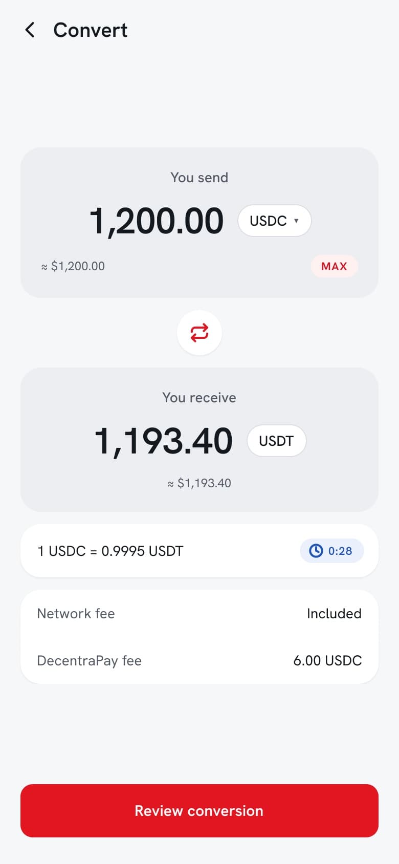
- An explicit 0.5% fee, no spread — 1,200 USDC → 1,193.40 USDT
- The full 42-character address, on both platforms
- One canon, four surfaces, cross-platform drift closed
- “Escrow only protects you while you stay on DecentraPay”
- Revolut as a quality bar, zero copied layouts
One map, one system, one delivery rhythm.
Product decisions
7 that shaped the productProblemMy first visual direction — editorial serif headlines, ink-heavy hero, mono numerals — was technically handsome and completely wrong for the product.
Reject my own direction and rebuild as friendly fintech.
WhyA payment app is used in a supermarket queue, not admired in a gallery. Premium had to mean warm and legible, not literary. The identity's distinctive character lives in the colour and the structure — not in a serif.
ImpactOne humanist sans across UI, display and numerals; soft floating cards; a large friendly balance instead of a monospaced ledger figure; red as accent only; ink reserved for the payment card. Recorded as decision DD-009.
Use Revolut as a quality benchmark, never as a template.
WhyCloning a competitor's trade dress is both a legal risk and an admission that you have no point of view. The bar to clear is their craft, not their layouts.
ImpactGeneric fintech patterns were adapted to DecentraHubs' identity; no screen, layout or trade dress was copied. The benchmark raised the ceiling without touching the drawing.
ProblemEvery payment interface is under quiet commercial pressure to say “instant”, to bury a fee in a spread, and to promise safety it can't deliver.
Write a money-honesty canon and give it veto power over the design.
Why“Instant” on a rail that takes a business day is a lie the interface tells on behalf of the business. Once it's written down, it stops being negotiable per screen.
ImpactSEPA Instant reads “in seconds”; SWIFT reads “usually within 1 business day”; bank payout is free and never called instant. Conversion shows an explicit 0.5% fee instead of a hidden spread — 1,200 USDC converts to 1,193.40 USDT with the 6.00 USDC fee stated on the screen.
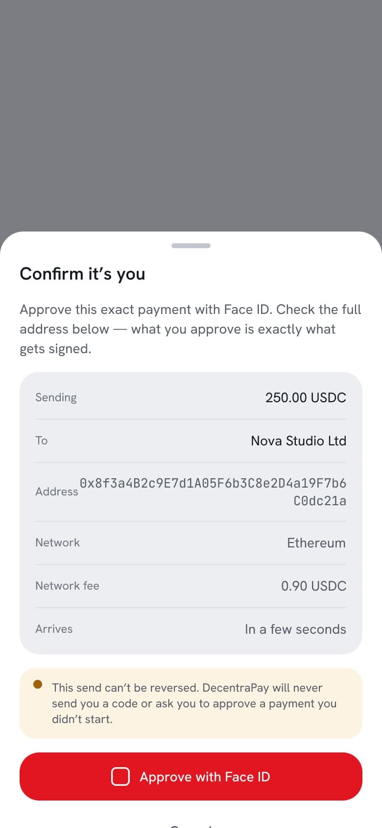
ProblemAn adversarial audit of the security screens found the step-up sheet claiming “nothing is hidden” directly above a truncated address — the exact condition address-poisoning attacks rely on. A normal design review had missed it for two versions.
Show the entire address, or drop the claim.
WhyWhat you approve must be exactly what gets signed. A shortened address makes the promise false and the attack easy.
ImpactThe full 42-character address now renders on the step-up sheet on both mobile and web, with copy that tells you to check it. The same audit broadened anti-social-engineering lines and rescoped a card-freeze screen that over-promised what freezing actually stops.
ProblemThe brief implied a yield product. Designing one means inventing rates, risk language and a regulatory posture nobody had signed off.
Refuse to invent Earn — then correct myself when I turned out to be wrong.
WhyYield is a product and regulatory decision, not a designer's improvisation. But a refusal held after the facts change is just stubbornness.
ImpactEarn was flagged as an open question rather than drawn. A later audit found it already existed on mobile — with genuinely good risk disclosure — so the honest move was to say I'd been wrong and build the six web screens to match, carrying the same “not a bank deposit, not covered by deposit insurance” language.
Treat dark mode as a mode, and prove accessibility by computation.
WhyInverted colours break finance UI, and nobody hand-checks contrast across 255 screens. Correctness has to be verifiable, not asserted.
ImpactEvery semantic token carries light and dark values, so dark renders by switching a collection mode. Contrast ratios are computed from the real tokens and published — including the two-red system (a brand fill for white-on-red, a darker text-red for red-on-light) that gets buttons, links and nav labels past AA at body size.
Run a 9-persona expert panel before calling it done.
WhyWork that only survives its author's eyes hasn't been tested.
ImpactScored 90.9/100 — a conditional go, not a clearance. Every in-file blocker was fixed the same day; the two that remained were escalated as client decisions rather than quietly guessed, and later resolved into both platforms.
Architecture
One product, four surfaces
Before a screen existed, the product was mapped: who each surface serves, which domains it carries, and where the same money truth has to appear twice.
The consumer app is the depth (13 domains, from KYC to P2P). The web app mirrors every one of them plus a settings hub. The merchant console is the B2B half. The backoffice is where compliance, card operations and treasury actually run.
Foundations
121 tokens, two modes
The token specimen is the contract: colour, type, spacing, elevation and status semantics, each with an explicit light and dark value. Dark mode is not a second design file — it is a mode switch on this collection.
Status never rides on hue alone: every state pairs an icon with a label, so meaning survives colour-blindness and greyscale.
The consumer app
Friendly, not clever
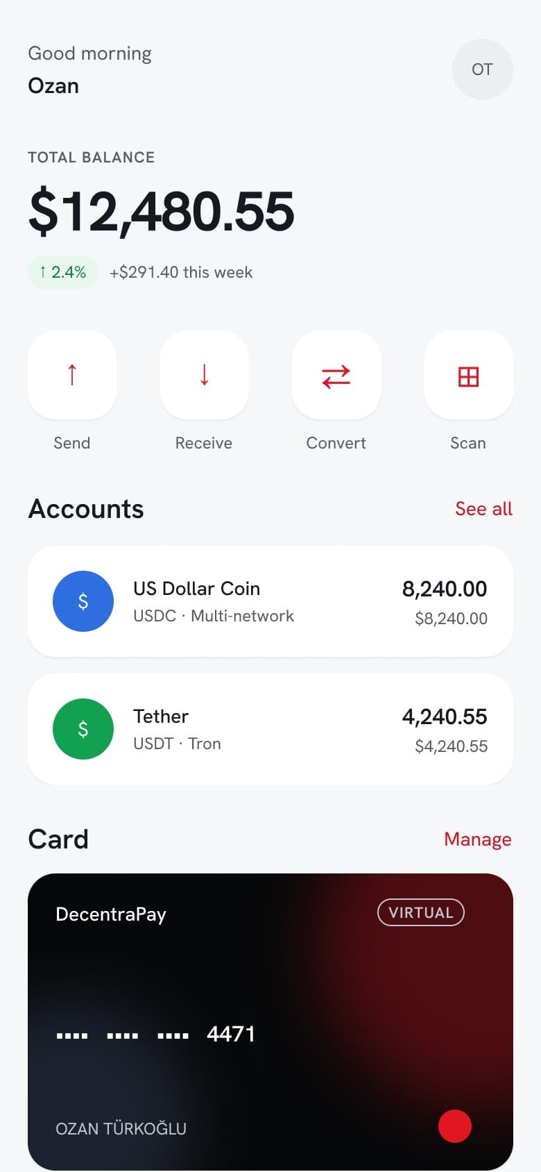
A large readable balance, four obvious actions, accounts as soft floating cards, and the only ink surface in the product reserved for the payment card. Red carries actions and nothing else.
Novice screens do work most crypto apps refuse to do — explaining what a stablecoin is, in plain language, before asking anyone to hold one.
Trust surfaces
Where the canon does its hardest work
These three screens are the product's real argument. The step-up sheet shows the full address and says plainly that what you approve is what gets signed. The anti-phishing hub gives the user a personal code and a complete never-ask list. The P2P check names the exact scam that empties accounts — “I've paid, please release” — before the trade, not after.
Each one also states its own limits: this send can't be reversed; escrow only protects you while you stay on DecentraPay.
Web app
Every mobile domain, mirrored
51 shippable screens across twelve domains: a dark-safe balance hero, honest estimated totals (“≈ £5,180.42 · updates with live rates”), activity where status is an icon and a label, and the Earn set built to close a real reverse-parity gap the audit exposed.
Merchant & operations
The half nobody screenshots
A payment product is only as honest as the desk behind it. The merchant console covers onboarding and KYB, invoices, refunds, payouts and a phone POS. The backoffice is where a compliance officer works a KYC case, a sanctions hit gets a second pair of eyes, and treasury stares at reconciliation breaks.
Maker-checker is designed in, not bolted on: the four-eyes flows include the approver's half, because an approval screen without an approver is a diagram.
Light & dark
One mode switch away
The same screens, rendered dark by switching the token collection mode — no redrawing, no per-screen overrides. This is what binding every semantic value buys: a theme is a property of the system, not a second project.
Accessibility
Ratios, not reassurances
Contrast is computed from the actual semantic tokens and published for both themes — including the awkward cases. Red is the hard one: the system carries two reds so that buttons, links and active nav labels clear 4.5:1 at body size instead of hiding behind a large-text exemption.
Beyond contrast: colour is never alone, targets are at least 44×44, focus order is documented on a real screen, and motion honours reduced-motion.
Motion
Specified, not improvised
Durations, easings and the rules for what each transition means — written down so the build doesn't invent them, and so nothing conveys meaning by motion alone.
Outcome
verified, qualitative where honest- 01
A handoff-ready product: 255 screens across four surfaces, 36 pages, 19 components, 121 tokens in light and dark, 7 clickable journeys, and the handoff documentation an engineer would otherwise have to ask for.
- 02
Honesty made structural rather than aspirational — a written canon, adversarial audits that caught real defects (a truncated address under a “nothing is hidden” claim; a card-freeze screen over-promising), and two cross-platform contradictions escalated as client decisions instead of quietly guessed.
- 03
The 9-persona panel scored it 90.9/100 — a conditional go. I've kept the word “conditional” here on purpose: it isn't shipped to end users, and the platform build carrying these decisions into code is still underway.
// Design delivered and handoff-ready; the production platform is in active development. No end-user metrics exist yet — so none are claimed.
More projects
DecentraHubs
Running a product studio — from brand systems to shipped software
Read case →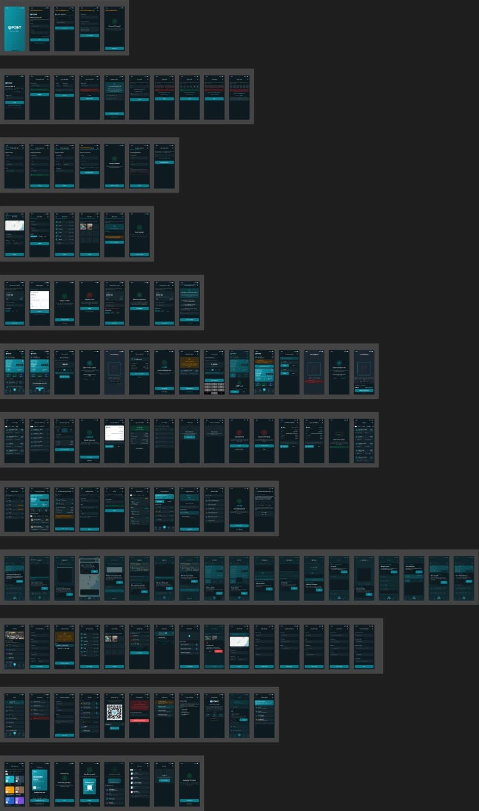
ePOINT v2.0
Rebuilding a live product as a token-driven design system
Read case →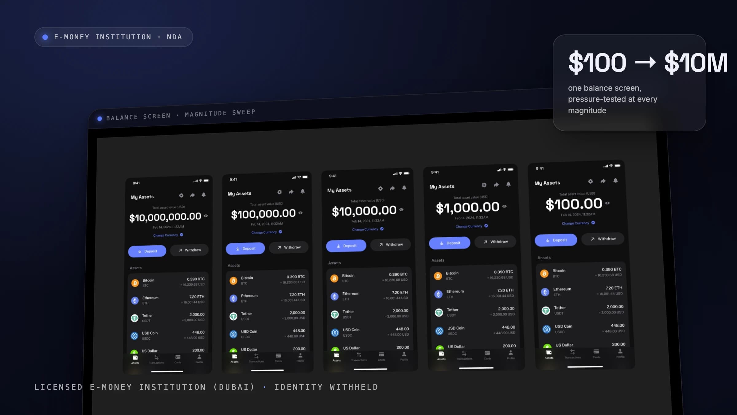
Payment App — NDA
The unglamorous 80% of fintech, designed on purpose
Read case →