Multi-asset payment app — name withheld
The unglamorous 80% of fintech, designed on purpose
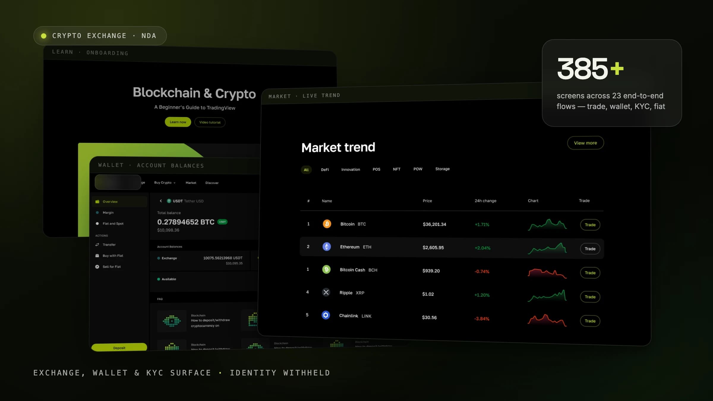
A payment application designed 0-to-1 at a licensed e-money institution in Dubai — 15 product areas from onboarding and KYC to deposit, withdrawal, transactions and card issuing, in light and dark themes with full loading, error, empty and maintenance coverage. The part most portfolios skip, designed on purpose.
Backdrop — the actual working file
- Role
- Senior Product Designer — UX/UI
- Client
- Under NDA
- Period
- Studio engagement
- Platforms
- iOS · Android
- Tools
- Figma
- Status
- Selected boards — identity withheld
Overview
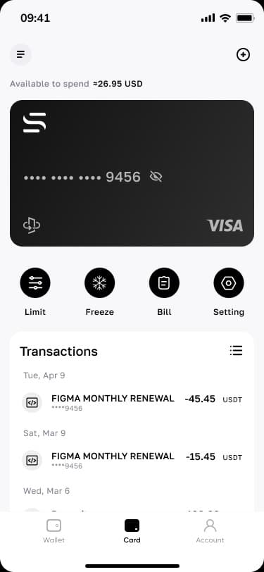
A payment app that holds crypto and fiat side by side: one asset list, deposit/withdraw actions, card payments and a payment-priority system deciding which balance pays first.
The client's name is withheld for commercial reasons — which is fitting, because the boards shown here are about discipline, not branding: what the wallet does when the number is huge, when the network fails, when the user isn't verified yet, and when the system is down.
Scope
- Onboarding, KYC & verification
- Wallet & balance architecture
- Deposit, withdrawal & transactions
- Card issuing & payment-priority rules
- Light + dark themes
- Loading / error / empty / maintenance states
Figures counted from the working files — not estimates
The challenge
Money UIs are designed at happy-path scale and break everywhere else: a $10,000,000.00 balance overflows the hero, an unverified user hits a wall with no path forward, an outage page reads like a crash. The brief here was the opposite — make the edge the spec.
My role
Interface design across the wallet's asset views, payment-priority rules and the full state matrix — shown as boards from the working file, anonymized per NDA.
Product decisions
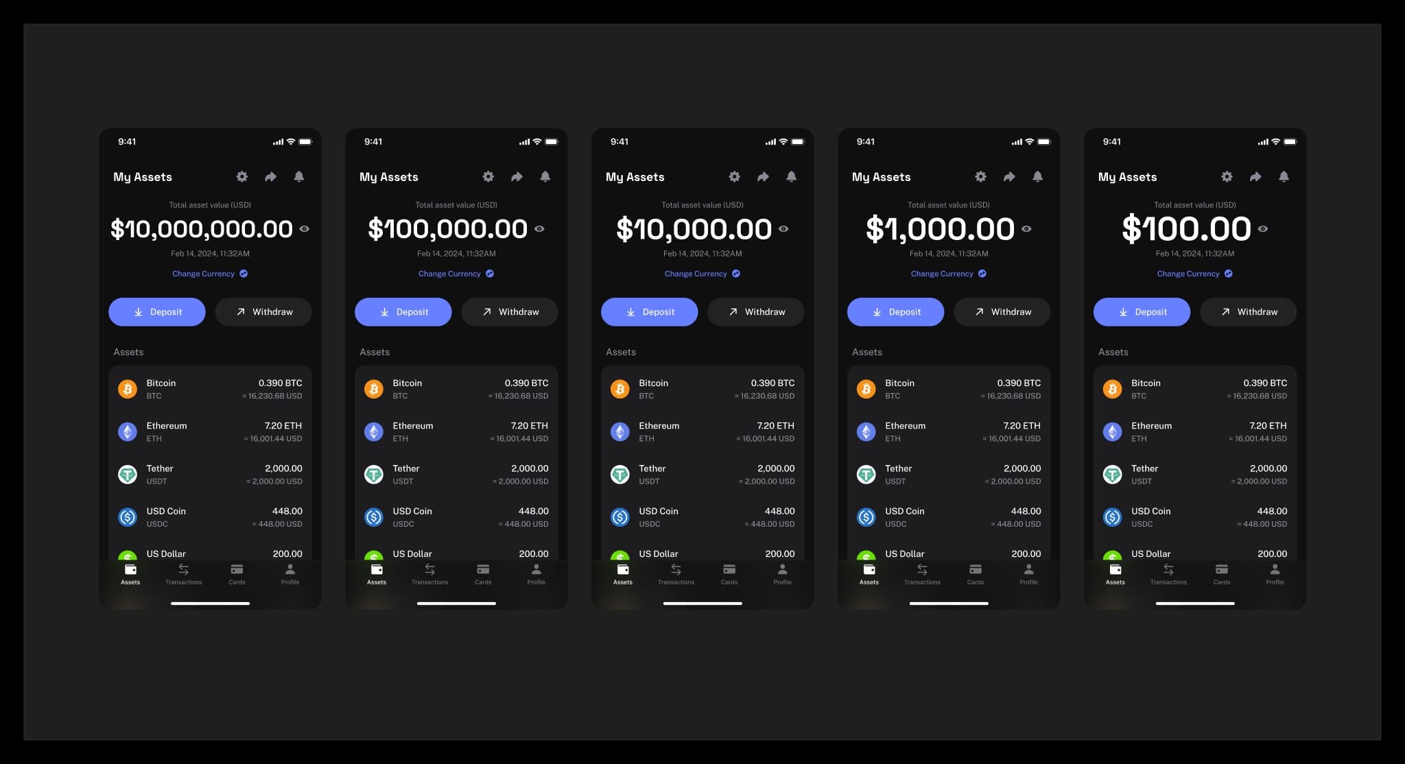
3 that shaped the productTest the balance typography against every magnitude, not the pretty one.
WhyThe same hero must hold $10,000,000.00 and $100.00 without breaking rhythm or trust.
ImpactA board that renders the identical screen across five magnitudes — the layout rule is proven, not assumed.
Make payment priority a visible, orderable rule — not a hidden default.
WhyWhen a card charge can pull from USDT, USDC or fiat, users must be able to predict which balance pays.
ImpactA drag-to-reorder priority surface that turns invisible wallet logic into an explicit user decision.
Design the restricted and broken states as first-class screens.
WhyVerification walls, loading, errors and maintenance are where fintech trust is actually won.
ImpactA complete state matrix — unverified, loading, error, maintenance — delivered alongside the happy path, not after it.
Systematic craft
One screen, five magnitudes
The balance hero rendered against $10M, $100K, $10K, $1K and $100 — typography, spacing and hierarchy holding at every order of magnitude.
Rules & recovery
Visible rules, designed failures
Payment priority as an explicit, reorderable list — and the full recovery matrix: error states, unverified walls and maintenance, each with a way forward.
Outcome
verified, qualitative where honest- 01
A payment app delivered 0-to-1: 15 product areas from onboarding and KYC to card issuing, in light and dark with full state coverage.
- 02
A state-complete wallet spec: happy path, restricted path and failure path designed to the same standard.
- 03
Wallet logic (payment priority) surfaced as user-controllable product behavior instead of hidden defaults.
// Client identity withheld under NDA (a licensed e-money institution in Dubai) — the boards speak for the craft.