Web trading platform
One exchange, two themes, three devices — one system
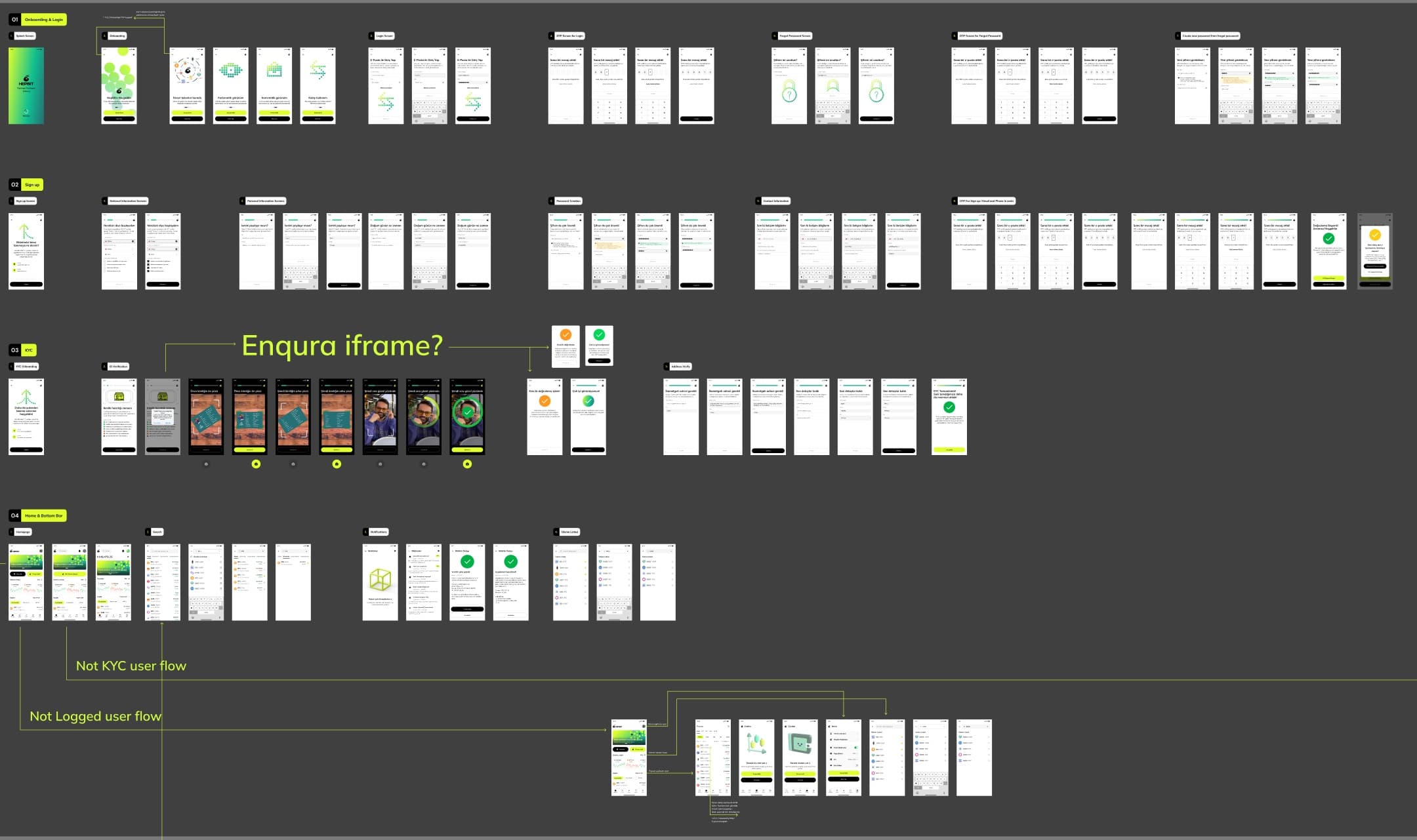
A crypto exchange launched 0-to-1: 385 development-ready screens across 23 flows — sign-up, KYC, 2FA, wallet, buy/sell, trading view and referrals — plus the product's first design system, every module built for desktop, tablet and mobile in light and dark.
Backdrop — the actual working file
- Role
- Product Designer — UX/UI
- Client
- Crypto exchange venture
- Period
- Studio engagement
- Platforms
- Web — desktop · tablet · mobile
- Tools
- Figma
- Status
- Ready-for-development file
Overview
An exchange is a system of dense modules — market tables, trend charts, wallets, KYC — that must stay coherent across breakpoints and themes. This file treats that as the actual deliverable: every module exists as a component set with desktop, tablet and mobile variants in light and dark.
Black ground, chartreuse action color, market data carried by classic red/green — restraint everywhere else so the numbers stay the interface.
Scope
- 385 screens across 23 flows
- Sign-up, KYC & 2FA
- Wallet, buy/sell & trading view
- Referrals
- First design system
- Dual-theme, responsive (desktop · tablet · mobile)
Figures counted from the working files — not estimates
The challenge
Six renders per module is where design systems usually fracture: dark tables drift from light ones, mobile drops features instead of adapting them. The discipline here is the matrix itself — one module, six honest renders, no orphans.
My role
Interface design across the module matrix — landing, market, wallet and KYC surfaces prepared to ready-for-development standard.
Product decisions
2 that shaped the productBuild modules as device × theme component matrices from day one.
WhyRetro-fitting dark mode or tablet layouts onto a shipped exchange is how inconsistency is born.
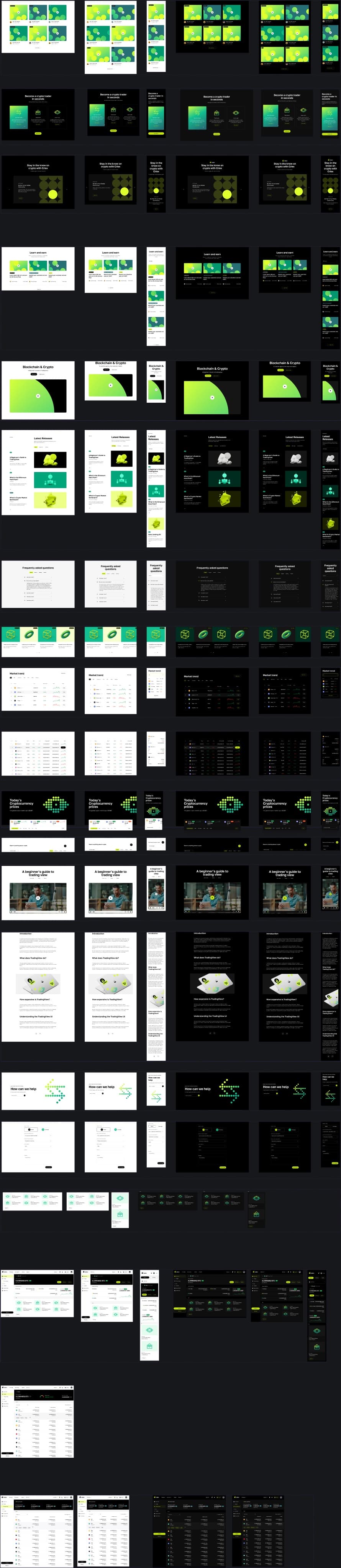
ImpactEvery stack — hero, market trend, tables, wallet, FAQ — carries its six variants side by side; drift is visible immediately.
Reserve color for money and action.
WhyOn a trading surface, decoration competes with data.
ImpactChartreuse for actions, red/green strictly for market movement, everything else near-monochrome — the price column is always the loudest thing on screen.
Trading surfaces
Markets and wallet, dark
The market-trend module with category filters and sparkline rows, and the asset-balances wallet — the two most data-dense surfaces in the product.
The matrix
Six renders per module
The stacks page is the system's proof: each module rendered across desktop, tablet and mobile in both themes. The tall board below is the working file itself.
Outcome
verified, qualitative where honest- 01
A crypto exchange taken 0-to-1: 385 development-ready screens across 23 flows, plus the product's first design system.
- 02
A ready-for-development exchange system where responsiveness and theming are structural, not decorative.
- 03
Data-dense trading surfaces that stay legible because color is rationed to meaning.